The Prompt Is Not the Product: Why Better AI Images Start With Better Decisions
A product photo looks flat, a social image feels generic, or a portrait has the wrong background. The instinct is often to write a longer prompt and hope the next result fixes everything. That usually makes the request harder to control. A better approach starts before generation: decide what must stay, what may change, and what the final image is supposed to do. Tools such as Kimg AI make it possible to generate visuals or edit an existing reference image, but the strongest results still depend on clear visual decisions rather than a pile of adjectives.
Longer Prompts Do Not Automatically Create Better Images
A detailed prompt can be useful, but detail only helps when it removes uncertainty. “Premium, cinematic, professional, modern, beautiful” sounds specific while telling the system very little about the actual scene. A stronger brief says that the product stays unchanged, the background becomes a pale kitchen counter, daylight enters from the left, and the composition leaves empty space on the right for copy.
Before writing the prompt, make one sentence that describes the job of the image. For example: “Show this coffee package clearly in a bright breakfast setting for a social post.” Once the job is clear, every extra instruction should support it. If a detail does not affect the subject, setting, composition, lighting, or intended use, it may not need to be there.
Separate What Must Stay From What Can Change
Reference-based editing becomes much easier when the source image is treated as a set of protected and flexible elements.
Imagine a small skincare brand has a usable phone photo of one bottle. The packaging shape, label position, cap color, and bottle proportions are factual details. They should remain stable. The table, wall, props, and lighting may be flexible because they only affect presentation.
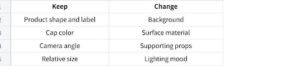
This prevents a common failure: accepting a beautiful result that quietly changes the thing being advertised. It also makes revision faster. If the background is wrong but the product is right, you know exactly what to correct. Without that separation, users often rewrite the whole prompt and accidentally lose the parts that already worked.
Three Decisions Matter More Than Decorative Prompt Words
When an AI image feels “off,” one of three practical decisions is often missing.
1. Decide the Visual Priority
Every image needs a first thing the viewer notices. For a product post, that may be the package. For a profile portrait, it is the face. For an event announcement, it may be the empty area reserved for text.
State that priority directly. If the product should dominate, ask for a clean composition with limited supporting objects. If the person is the focus, avoid a background packed with competing details. Good prompts guide attention instead of simply asking for more visual richness.
2. Decide Which Reference Controls Which Detail
Multiple reference images are useful only when their roles are clear. One reference might control the subject, another the outfit, and another the setting. Nano Banana AI supports up to four reference images, so a user can provide separate visual guidance instead of forcing one image to contain every desired element.
The important step is assigning those references jobs. “Use image one for the person and image two only for the jacket” is much clearer than uploading several pictures and expecting the system to guess the intended combination.
3. Decide What Success Looks Like Before You Generate
If you cannot describe what would make the result usable, you cannot review it consistently. A restaurant owner might define success as: the dish remains unchanged, the table looks cleaner, no extra ingredients appear, and the image still feels like natural daylight.
Those criteria make rejection easier. You are not asking whether the new picture is “nice.” You are checking whether it solved the original problem. This keeps experimentation from turning into endless generation with no clear stopping point.
Edit One Major Variable at a Time
A common mistake is asking for a new background, new clothes, different lighting, a different camera angle, and a new art style in one pass. Even when the result is attractive, it becomes difficult to know which change helped and which one caused an error.
A controlled edit works more like troubleshooting. Change the background first. Check the subject. Then adjust lighting if needed. If you later want a stylized version, create it from the approved realistic version rather than restarting from the original with a completely new brief.
This method is especially useful for business images because accuracy matters. A café can test a cleaner table without changing the drink. A seller can improve a listing background without altering the item. A creator can restyle a portrait while keeping the person recognizable.
One major change per round may feel slower than asking for everything at once, but it often reduces the number of confusing revisions because each result has a clear purpose.
Use Image-to-Video Only When Motion Adds Information
Turning a still image into video can be useful, but motion should have a reason. A product image does not become better marketing just because the camera moves around it.
Start with a still that already works. Then decide what motion would make the idea clearer. Steam rising from a cup can suggest freshness. A curtain moving beside a travel product can add atmosphere. A character turning slightly toward the camera can make a portrait-based clip feel alive.
Kimg AI publicly offers image-to-video creation, so a finished still can be used as the starting point for motion. The key is restraint. If the subject, camera, background, lighting, and every object move at once, the viewer may notice the effect rather than the message.
A useful test is simple: describe the motion in one short sentence. If you need a paragraph to explain what should happen, the scene may be trying to do too much. Solve the visual idea in the still first, then animate the smallest meaningful action.
Review the Boring Details Before You Publish
The final review should be less exciting than the generation stage. That is a good thing.
Zoom in on text, logos, fingers, jewelry, repeated patterns, packaging edges, reflections, and background signs. Compare an edited product with the original. Compare an edited portrait with the source face. If the image represents something real, accuracy should be checked before style.
Then view the result at its actual destination size. A social thumbnail may hide subtle background details. A marketplace listing may make a small label error obvious. A website banner may crop away the object that was supposed to be important.
Finally, ask whether the image still has one clear job. If extra props, dramatic lighting, or decorative effects make the subject harder to understand, remove them. “More generated” is not the same as “more useful.”
Conclusion
Better AI visuals rarely begin with a magical phrase. They begin with decisions: what the image must communicate, what must remain accurate, which references control which elements, and what should change first. A shorter prompt built around those decisions can be more useful than a long list of attractive adjectives. Treat each generation like a test with clear success criteria, review the small factual details, and add motion only when it contributes something. For your next image, define the job and the protected details before you write the first prompt.