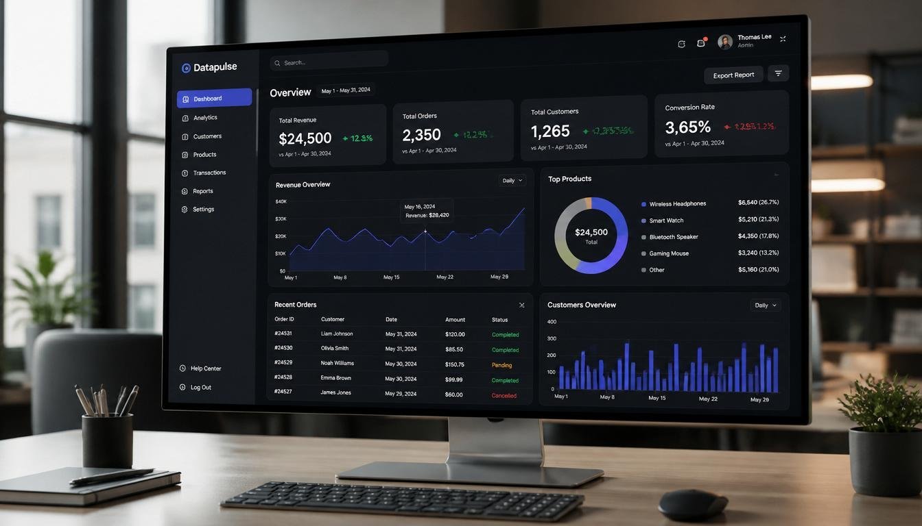
The Future of Admin Dashboard Design: Trends Shaping Modern Interfaces
Key Takeaways
-
Adopting modular grid layouts enhances data organization and readability.
-
Minimalist designs reduce cognitive load, improving user focus.
-
Integrating AI features streamlines workflows and offers predictive insights.
-
Responsive designs ensure seamless experiences across devices.
-
Real-time data visualization aids in prompt decision-making.
Admin dashboards are evolving rapidly, driven by the demand for efficient business operations and high-quality user experiences. Staying informed about contemporary design principles ensures administrative platforms perform optimally while remaining intuitive. For design inspiration and practical references, consider exploring these admin dashboard UI design examples that showcase current best practices.
Modern dashboard design transcends mere aesthetics, focusing on the structured presentation of complex information to facilitate quick data digestion and manipulation. This is crucial for enhancing business analytics and tracking operational KPIs, where adopting current design trends can significantly improve productivity and user satisfaction. As data volumes increase, dashboard interfaces must strike a balance between clarity for newcomers and customization for advanced users. Effective design choices not only enhance workflow efficiency but also enable faster, more informed decision-making for businesses. Staying updated on design trends is vital for organizations to remain competitive, allowing for scalability and adaptability in a rapidly evolving technological environment. Companies that prioritize these practices are likely to experience gains in decision-making speed, data understanding, and overall user experience.
Modular Grid Layouts
Structuring dashboards with modular grid layouts, such as the “Bento Grid,” enhances clarity and accessibility by segregating data into distinct areas for easier comparison and prioritization. Each grid segment serves a specific purpose, with elements that adaptively resize based on screen size or data volume. This design enables easy configuration, supporting scalability and customization tailored to user needs. It also promotes teamwork by segmenting metrics by department while maintaining dashboard unity. This modular approach is especially beneficial in rapidly growing organizations, helping prevent clutter and facilitate integration with new data sources.
Minimalist Design
Minimalist dashboard design strips away unnecessary elements, sharpening user focus and supporting faster data interpretation. Features like soft shadows, clear typography, and restrained color schemes guide attention where it matters and reduce the risk of visual exhaustion, especially during extended use. Subtle elevations and microinteractions reinforce navigation intuitively without overwhelming the user. Adapting contrast for low-light or high-glare environments enhances comfort and accessibility, helping users stay productive in a range of conditions.
Minimalism is also closely linked with accessibility. By reducing busy backgrounds and dense information, color contrast and font readability naturally improve, making your dashboard more usable for everyone, including those with vision or cognitive challenges. Implementing accessibility-first design not only broadens your audience but also demonstrates a commitment to universal usability. Ultimately, a minimalist approach creates a calm digital environment, decreasing user stress and cognitive fatigue across all organizational roles.
AI Integration
Artificial Intelligence is transforming dashboards by automating routine actions and enabling predictive analytics. AI-driven systems dynamically analyze user roles, behavior, and context to present relevant data and actionable insights—without requiring manual customization. For example, AI can automatically surface warnings when anomalies are detected in business metrics or optimize the dashboard layout based on the user’s most common tasks. This reduces manual configuration for users, boosts operational efficiency, and opens up new levels of personalization. Predictive analytics, made accessible through these features, empower users to respond to issues before they escalate.
Machine learning models embedded in dashboards can also help businesses uncover patterns and correlations that may not be obvious at first glance. From forecasting sales trends to optimizing inventory or predicting customer churn, AI-rich dashboards provide a forward-looking edge. What’s more, conversational AI elements, such as chatbots, are increasingly being integrated, allowing users to request custom reports or insights in plain language, dramatically improving the user experience and greatly reducing the learning curve for new team members.
Responsive Design
Responsive design is crucial for ensuring seamless access across devices like desktops, laptops, tablets, and smartphones. A mobile-first approach enables fast-loading dashboards that function across all screen sizes. While detailed visualizations cater to larger monitors, mobile interfaces focus on usability through gesture-friendly design. Key information is prioritized, with advanced features in expandable menus to maintain a clean interface. This design maintains data access continuity in a hybrid work environment, supporting real-time collaboration and improving onboarding through consistent navigation, thereby enhancing productivity across the organization.
Real-Time Data Visualization
The need for up-to-the-moment insights means dashboards must handle and present live data efficiently. Technologies such as Angular and React enable real-time updates and native-feeling interactions. This makes filtering, sorting, and navigating large datasets instantaneous. Micro-feedback mechanisms, such as brief color flashes or icon shifts, provide users with real-time confirmation that their actions are registered and processed. This instant feedback makes dashboards feel fluid and responsive, promoting trust and satisfaction.
With real-time visualization, teams can spot outliers, bottlenecks, or system anomalies the moment they appear, mitigating risks before they grow. Customizable alerts and triggers can be set, ensuring that mission-critical thresholds are never missed. As a result, organizations can confidently act on opportunities and challenges as they emerge, ensuring that decision-making is always based on the most current information available.
Conclusion
Keeping up with advancements in admin dashboard design ensures platforms remain both functional and user-centric. By prioritizing modular structures, clean minimalist visuals, AI-driven features, full-device responsiveness, and instantaneous data visualization, organizations position themselves for success. Ultimately, evolving dashboard design is not only about aesthetics—it is about enabling better decisions, faster actions, and ongoing user engagement in an increasingly data-rich world.