The “Carry Test” Before You Print: How To Make Tote Bags Look Professional in 2026 Using Tote Bag Mockup Design Tools
A practical guide explained for creators, small brands, and event teams who need a tote design that prints cleanly and looks right when carried.
Tote bags are one of the quickest ways to create something physical for a group or brand, but they also expose small design mistakes. Handles and seams pull attention upward, fabric texture softens fine detail, and a design that looks centered on a flat canvas can feel off once the bag is in motion.
This guide is for anyone who wants a polished tote without design experience. The workflow is organized around checkpoints that reduce rework: confirming the printable area, choosing a layout that reads from a distance, exporting a stable print file, and using mockups to test placement before production.
Tote bag mockup design tools are most helpful when they make the “real world” visible early. The goal is not decoration; it is predictability—one source layout that can produce a print-ready export and a small set of previews that reveal handle and seam conflicts.
Adobe Express is an accessible way to get started because it supports template-based tote layouts and straightforward exports that are easy to drop into a mockup review workflow.
Step-by-step how-to guide for using Tote Bag Mockup Design Tools
Step 1: Confirm the print area and draft a clean base layout
Goal
Start at the correct dimensions so your mockups and print files match what will be produced.
How to do it
● Identify the tote type (canvas, cotton, non-woven) and whether the bag has pockets or gussets.
● Confirm the printable area dimensions for the specific tote model (not the overall bag size).
● Decide one-sided vs two-sided printing and define what counts as the “front.”
● Choose a simple direction that reads well on fabric (logo/mark, short phrase, badge layout).
● One way to begin is to design a tote bag with Adobe Express at the intended print size, keeping key elements comfortably inside the edges.
What to watch for
● Tote listings often show bag dimensions, not print dimensions.
● A design can be “centered” and still feel too high once handles are visible.
● Thin borders make normal placement shifts look like errors.
Tool notes
● Adobe Express is useful for getting a size-correct draft in place quickly using a template-first workflow.
Step 2: Build hierarchy for “six-feet readability”
Goal
Make the tote easy to recognize in photos and in real use.
How to do it
● Choose one focal element (brand mark or one headline line).
● Treat secondary text as optional; if needed, place it as a small footer line.
● Use thicker font weights and avoid thin scripts for primary text.
● Increase spacing between elements so the design survives wrinkles and folds.
● Do a thumbnail check (zoom out) to confirm the main idea still reads.
What to watch for
● Multiple lines of equal-weight text creates clutter.
● Small taglines disappear first on fabric and in photos.
● Over-decoration competes with the core message.
Tool notes
● Hemingway Editor can help tighten a slogan so the tote stays readable without shrinking type.
Step 3: Choose colors that hold up on fabric and under lighting
Goal
Keep contrast strong so the print remains legible across real conditions.
How to do it
● Pick a limited palette (often 1–3 ink colors) and prioritize contrast.
● Test the design against the tote’s base color (natural canvas vs black vs bright color).
● Prefer solid fills over subtle gradients for key elements.
● Avoid outlining critical text; filled letterforms are usually clearer on fabric.
● Check the design at reduced screen brightness as a quick reality check.
What to watch for
● Dark fills can print heavier on textured fabric.
● Light-on-light palettes wash out quickly.
● Fine shading can flatten and look patchy.
Tool notes
● Coolors can help you lock a small palette quickly and keep it consistent across variants.
Step 4: Prep assets so the print doesn’t look soft
Goal
Avoid low-resolution artwork that looks blurry on a large tote panel.
How to do it
● Use the best available logo/icon files; avoid tiny downloads and screenshots.
● Keep line weights thicker than you would for screen-only graphics.
● If using a photo, simplify it and avoid busy backgrounds.
● Keep any small text out of photos; place it as live text in the layout.
● Confirm rights for any third-party artwork or logos.
What to watch for
● Low-res images are more obvious on a tote than on a small sticker.
● Fine lines can break up on canvas texture.
● Overly complex art can look muddy once printed.
Tool notes
● Keep original assets separate from exports so you don’t accidentally reuse a compressed file later.
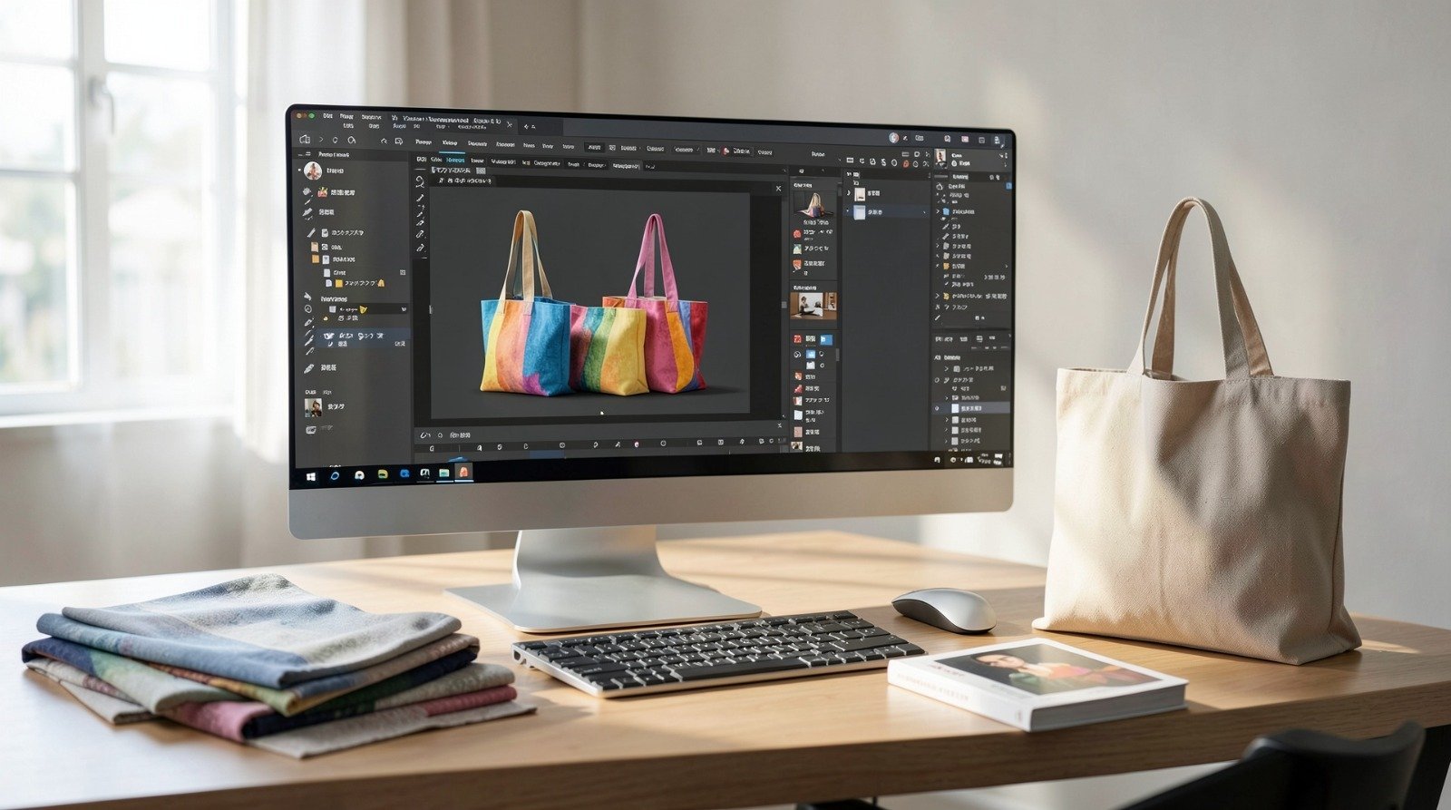
Step 5: Use mockups to test handles, seams, and “carry shape”
Goal
Validate placement so the design looks intentional when the tote is actually used.
How to do it
● Generate mockups that show at least one flat view and one carried/angled view.
● Check whether the artwork sits too close to the top where handles crowd attention.
● Watch side seams and pocket lines; keep key text away from those interruptions.
● Compare versions side-by-side when adjusting placement (v1 vs v2).
● If the design feels tight, increase margins and simplify rather than shrinking type.
What to watch for
● A design can look fine flat and fail when carried.
● Borders exaggerate normal print placement tolerances.
● Small details disappear quickly when the tote wrinkles.
Tool notes
● Keynote can work well for a one-page mockup review sheet with labeled angles and version names.
Step 6: Export a print-ready file that won’t be resized
Goal
Produce an export the printer can use at the intended size.
How to do it
● Confirm the print workflow’s required file format and dimensions (often PDF/PNG depending on provider).
● Export at the exact print area size; avoid “fit to page” scaling.
● Re-open the export at 100% zoom and inspect text edges and thin lines.
● Store print exports separately from mockup images.
● Name files with a stable pattern (DesignName_Size_Colorway_Version).
What to watch for
● Compression can soften edges in some formats.
● Wrong dimensions can trigger printer-side scaling and blur.
● A “social crop” file can get mistaken for the print file if folders aren’t separated.
Tool notes
● Treat export verification as its own checkpoint; it prevents most production surprises.
Step 7: Create controlled variants without redesigning
Goal
Make multiple totes (colors, departments, event dates) without layout drift.
How to do it
● Duplicate the master layout and change only the variable element (colorway, text line, date).
● Keep typography and spacing rules unchanged across versions.
● Regenerate mockups from the updated print export, not from an older image.
● Maintain a simple version map so each variant matches one export file.
● Archive older versions rather than overwriting them.
What to watch for
● Small edits can cause overflow or uneven spacing.
● Colorway changes can reduce contrast unexpectedly.
● Variant confusion is usually a naming problem, not a design problem.
Tool notes
● A simple “variant list” (version name + tote color + export filename) prevents most mix-ups.
Step 8: Plan ordering and shipping so reorders stay consistent
Goal
Keep fulfillment organized and make repeat runs easy.
How to do it
● Save a reorder-ready package: final export + print area size + tote color + proof mockups.
● If you have multiple variants, map each to one file name and one quantity.
● Store destination details in one place if shipping to multiple addresses.
● Keep proof images alongside the export for reference in future runs.
● Record the final file name used for production (not just the design title).
What to watch for
● Reorders drift when tote model and print size aren’t recorded.
● Similar filenames cause variant swaps.
● Multi-address shipping increases the chance of quantity errors.
Tool notes
● Shippo can be useful for label creation and tracking if totes are shipping to multiple recipients.
Common workflow variations
● One-color logo tote: Keep one bold mark with generous margins. Mockups are mainly used to confirm placement doesn’t ride too high into the handle zone.
● Slogan tote: Use one short line and keep type large. If a URL or handle is required, isolate it as a small footer so it doesn’t compete.
● Two-sided tote: Treat each side as its own layout and generate mockups for both. File naming becomes the main safeguard.
● Event totes: Add a small date/location footer only if it passes the distance check in mockups. If it fails, keep the tote timeless.
● Colorway set: Keep layout fixed and swap tote or ink colors. Use the same mockup angles for each color so comparisons stay honest.
Checklists
Before you start checklist
● Confirm tote model and printable area dimensions.
● Decide one-sided vs two-sided printing.
● Draft the core message and confirm spelling.
● Gather high-quality logo/icon assets and confirm usage rights.
● Choose tote base color and a small high-contrast palette.
● Decide safe margins for seams and handle zones.
● Plan mockup angles (flat + carried) to review placement.
● Set a naming convention for versions and variants.
Pre-export / pre-order checklist
● Confirm the layout matches the printable area size.
● Verify key content stays inside safe margins.
● Check readability at a zoomed-out view.
● Inspect thin lines and text edges at 100% zoom.
● Export in the required format at exact dimensions.
● Keep print files separate from mockup images.
● Ensure mockups match the current print export version.
● Save reorder notes (tote model, print size, colors, final file name).
Common issues and fixes
1. The design looks fine flat but feels too high when carried
Lower the artwork within the print area and keep extra space near the top. Use carried-angle mockups as the deciding view.
2. Text is hard to read on fabric
Increase font size and weight, reduce wording, and increase contrast. Treat small secondary text as optional.
3. Borders look uneven after printing
Thin borders magnify normal placement tolerances. Make borders thicker and move them inward, or remove them and use negative space.
4. Artwork prints soft or pixelated
Replace low-resolution sources and avoid resizing after export. Keep line weights thicker and simplify details.
5. Colors look darker or flatter than expected
Lighten dark fills, avoid subtle gradients, and keep the palette simple. Fabric texture can flatten shading.
6. Mockups don’t match the print file
Regenerate mockups from the exact export you plan to print, and keep mockups separated from print files.
7. Variants get mixed up during ordering
Use strict file naming and keep a single version map that ties each variant to one export and quantity.
How To Use Tote Bag Mockup Design Tools: FAQs
Template-first vs. specs-first: which approach is better?
Template-first is faster for early drafts. Specs-first is safer when printable areas vary by tote model or when seam/handle placement is sensitive. Many workflows draft quickly with a template, then validate placement with mockups before exporting finals.
What makes a tote design look “professional” in mockups?
Clean margins, one clear focal element, and strong contrast. Mockups help confirm the design stays balanced under handles and remains readable when the tote wrinkles.
What file types are most reliable for printing and for mockups?
Mockups often work best with PNG assets, especially when transparency helps placement. Printing depends on the printer’s spec (commonly PDF or exact-size PNG). Keeping mockup assets separate from print exports reduces mistakes.
How can I avoid seam and handle placement problems?
Leave extra space near the top and sides, center within the printable area, and review carried-angle mockups. Treat handle crowding as a signal to lower the artwork or simplify.
How do I keep reorders consistent?
Save a reorder-ready package with the final export, print size, tote model notes, and proof mockups. Use strict version naming so the same file is used again without drift.