How Wallpaper Can Redefine Your Home’s Style
Wallpaper has made its way back into regular homes, not only “special” rooms. The reason is simple: one surface can change the whole mood. Before you pick peel-and-stick, vinyl, or a traditional paste option, it’s worth setting a few expectations about lifespan, humidity, and upkeep. This guide on how long does peel and stick wallpaper last is a helpful starting point, especially for Toronto spaces that deal with dry winter heat and sticky summer air.
In the sections below, you’ll see where wallpaper changes a room most, how to pick the right style for each space, and which design directions are showing up often right now. The goal is a room that feels intentional, not random.
Why Wallpaper Matters in Modern Interior Design
Wallpaper matters because it does two things at once. It covers a big area, and it adds finish through pattern, texture, and repetition. When the print is chosen with the room in mind, it can calm things down (soft texture, low-contrast pattern). It can also energize a space (high contrast, graphic shapes), or add layers (florals, block prints, mixed motifs).
There’s also a shift in how people use it. Wallpaper used to be treated as “one wall only” by default. Now it shows up in smaller, sharper placements: ceilings, alcoves, the back of shelving, even narrow sections that frame a doorway. Done well, it reads as deliberate. Done carelessly, it reads as clutter. The difference usually comes down to scale, color, and where the eye lands when you enter the room.
Wallpaper can be a more predictable choice than paint, too. Paint changes a lot with lighting, sheen, and wall condition. Wallpaper shows you the pattern and texture upfront, so the result tends to match what you expected, as long as the wall is prepped properly and the rolls match dye lots.
Choosing the Right Wallpaper for Every Room
Entryways and hallways
These are often overlooked, yet they are the first spaces you see. Wallpaper works well here because it adds character without competing with furniture (there usually isn’t much). Mid-scale patterns often hit the sweet spot. Tiny repeats can look busy in a narrow corridor, and oversized prints can feel chopped when broken by doors.
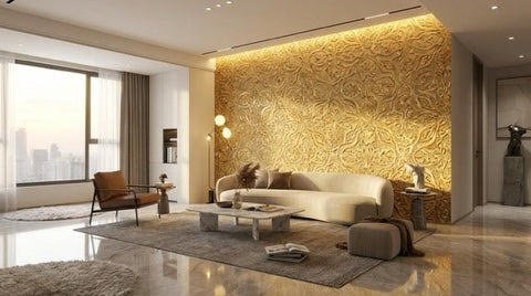
Living rooms
The living room is where wallpaper can either support what you already own or act as the main visual element. If your furniture is bold, lean into texture-first wallpaper: linen looks, grasscloth-style finishes, or tone-on-tone geometrics. If the furniture is simple, wallpaper can carry more pattern without fighting the rest of the room. In open-concept layouts, it often helps to keep wallpaper in one defined zone, like a TV wall, a reading nook, or a dining corner. It keeps the space from feeling fragmented.
Bedrooms
Bedrooms tend to work best with calmer wallpaper choices. Muted florals, gentle stripes, or abstract patterns with low contrast can add softness without making the room feel “active.” A common choice is the wall behind the headboard. It frames the bed, sets the tone, and leaves the remaining walls quieter.
Kitchens and bathrooms
In these rooms, material matters as much as design. Kitchens deal with splashes and cooking residue. Bathrooms deal with humidity and quick temperature changes. Vinyl wallpaper is often chosen because it’s easier to wipe clean and handles moisture better than many paper-based options. Peel-and-stick can work in some bathrooms, but results depend heavily on wall prep and ventilation. A steamy room, a poorly cleaned wall, or an uneven surface can lead to lifting edges or bubbles.
Kids’ rooms and nurseries
Here, washability and removability can matter more than anything else. Tastes change quickly, and little hands test walls. Removable wallpaper is a popular pick because it’s easier to swap later. Current themes lean toward softer palettes, playful murals, simple shapes, and nature or learning motifs (maps, animals, stars). If you want it to last beyond toddler years, choose a theme that still feels good at age seven or ten.
Trends in Wallpaper Designs
Wallpaper trends come and go, but they tend to circle around a handful of themes: nature, graphic pattern, quiet texture, nostalgia, and culturally rooted motifs. Here are styles that show up often in current collections and editor picks.
Classic Floral and Nature-Inspired Prints
Florals never fully leave. They just change their scale and color story. Right now you’ll see everything from delicate trailing vines to oversized blooms that feel more like wall art than “traditional floral.” Nature prints also go beyond flowers: branches, leaves, birds, and landscape-style scenes appear in both muted and high-contrast versions.
If you want a floral that’s easier to live with, keep the palette limited. A print with two or three main colors is often simpler to style than one with eight. You can then echo those colors in textiles, art, or a rug. The wallpaper stops feeling like a separate idea and starts feeling like the room’s base.
Bold Abstract and New Age Patterns
Abstract patterns work because they don’t tie the room to one specific era. You’ll see brushstroke effects, curved “blob” shapes, layered lines, and mural-style gradients. Many of these designs are forgiving at seams, too, since the shapes aren’t meant to match with the precision of a strict geometric repeat.
A small caution helps here. Strong abstract wallpaper needs breathing room. It tends to look best on one main wall, or in a space where you can control the sightline, like a stair wall, a dining nook, or behind a sofa. Put it on every wall in a busy room and it can feel loud fast.
Minimalist and Modern Designs
Minimal doesn’t mean blank. Modern wallpapers in this category often rely on texture or very subtle patterns. Think plaster looks, linen looks, fine lines, and low-contrast geometrics. These designs can make a room feel finished without pulling attention away from furniture and art.
This category can be a smart fit for condos and smaller rooms. High contrast can make walls feel closer than they are. A soft, textured wallpaper can add depth while keeping the space calm. If you want warmth, choose warmer neutrals and a visible texture rather than a flat cool white.
Playful Kids and Nursery Wallpapers
Kids’ wallpaper is less character-driven than it used to be. Instead of large cartoon faces everywhere, many rooms now lean into storybook scenes, soft skies, woodland animals, simple shapes, and murals that suggest a theme without shouting it. Another common thread is gender-neutral design, which makes it easier to hand down or keep longer.
If you want a playful room without visual overload, wallpaper one wall only. The crib wall, reading corner, or wall behind a dresser is usually enough. It frames the room while keeping other surfaces simpler.
Retro & Vintage Looks
Vintage wallpaper trends tend to show up in two forms. First, true heritage patterns: toile, stripes, heritage florals, and small repeats that feel classic. Second, nostalgia prints: bolder colors, playful shapes, and designs that hint at mid-century or 70s styling.
The easiest way to keep a vintage wallpaper from feeling like a theme room is contrast. Pair it with simpler furniture lines, modern lighting, and clean window treatments. The room feels layered instead of “costumed.”
Cultural & Artistic Arabesque and South Asian Motifs
Arabesque patterns use flowing, interlaced curves and stylized plant forms rooted in long decorative traditions. South Asian-inspired motifs often include block-print style florals and paisley-like shapes, with repeats that feel hand-made even when printed.
If you’re using culturally rooted motifs, restraint helps. A detailed arabesque pattern can read calm when the colors stay limited. A bright paisley or block-print style wallpaper can become the main feature, especially in an entry or dining room.
In both cases, let the wallpaper lead. Keep the rest of the room quieter so the pattern has space to read clearly.
How to Make a Statement with Accent Walls
An accent wall works best when there’s a reason for it. It might frame a focal point like the bed, sofa, or dining table. It might correct a layout issue, like a long hallway or an awkward nook. Without a reason, it can look like an afterthought.
A few habits that prevent common mistakes:
- Plan for pattern repeat and seams. Some prints require matching. That affects how many rolls you need and where seams land. It also matters that rolls come from the same dye lot, since color can shift slightly between runs.
- Check lighting at different times. Wallpaper that feels subtle in daylight can read busier at night under warm bulbs. A sample taped to the wall for a day or two can save you from surprises.
- Match scale to the wall. Large prints can feel clean and dramatic, but they can overwhelm a very small wall, especially if cut up by windows or doors. Smaller repeats are often easier in tight spaces.
- Prep the wall carefully. Many failures come from prep issues: old adhesive, dust, uneven texture, or applying over existing wallpaper. A smooth, clean surface makes the final result look sharper and helps edges stay down.
If you want a statement without committing to a full wall, try a smaller surface. The back of a bookcase. A powder room ceiling. The inside of a closet. These spots are small, yet memorable.
Where to Find High-Quality Wallpapers Online
Shopping online can work well, but wallpaper rewards a little homework. Treat it like fabric. Order samples, check them in your lighting, and confirm the basics before you buy multiple rolls.
What to check before ordering:
- Material and backing: Vinyl, non-woven, and paper-backed wallpapers behave differently when it comes to durability, cleaning, and removal.
- Washability: Important for kitchens, bathrooms, kids’ rooms, and high-traffic hallways.
- Pattern repeat: A larger repeat can mean you need more material to match seams. That changes the total number of rolls.
- Shipping and returns: For Canadian buyers, it helps to know where the item ships from, how long it takes, and whether there are duties or restocking fees.
If you’re shopping within Canada, Grovetree Décor is one option for buying wallpaper online, especially if you prefer ordering samples first and then committing once you’ve seen the colors and texture in your own space.